It is always easier to sketch out a page design rather than build straight out or do a detailed mockup - it is lower cost and gives everyone a common thing to frame discussions around.
Here are a few of the early sketches from the alpha.gov.uk project, some of which include features that we either dropped when we realised they would work or haven't got around to implementing yet.
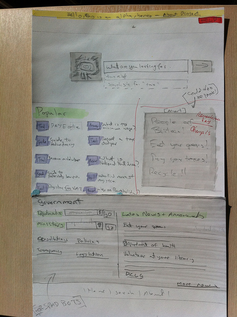
Tools
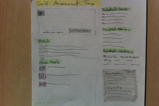
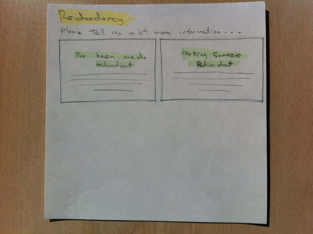
An early version of a tool landing page missing the 'set expectations' (this will take 30 minutes, you will need a credit card etc) section.
In the bottom right is a section that was intended to show related government consultations. We dropped this when we realised that doing online engagement properly required more than just linking to relevant consultations, but there is definitely scope adding contextual engagement in the future.
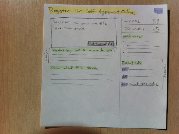
A later version with a single related content area and the 'set expectations' section.
Search results
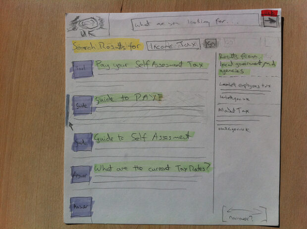
A two column layout for search results (results from alpha.gov.uk in the left, results from the rest of gov.uk in the right). It didn't quite feel right when we actually built it (as @marthalanefox spotted in a flash!) so we moved to the single column plus radio buttons that you can now see on the site.
Guides
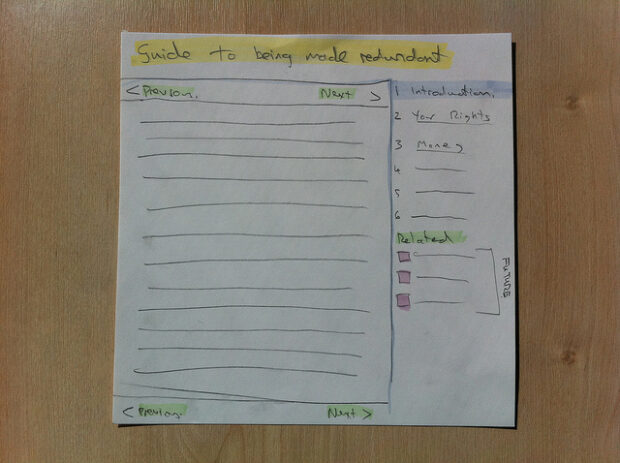
We wanted guides to feel self-contained, to have 'edges', so you could have an idea of the amount of content there is to get through, hence the right-hand navigation.
After the initial build of these pages we went on to add a link to a video version, a print version and a timestamp saying when the guide was last updated.
We also knew we needed to solve the problem of overlapping topics so came up with the disambiguation.
Bank holidays
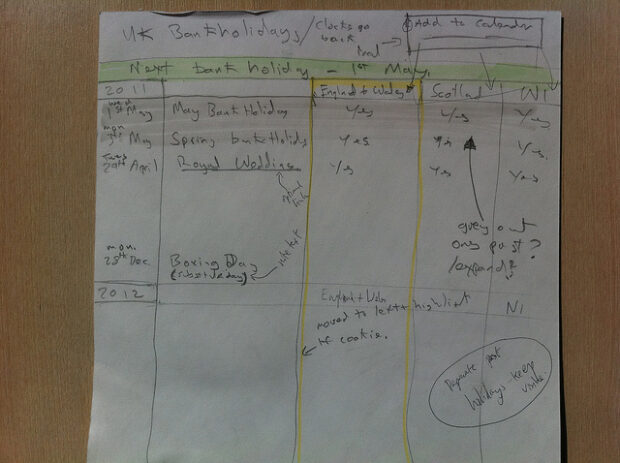
An alternative version of the bank holidays page. We later changed to a tab for each country that we could default to if a person's location is set.
Homepage
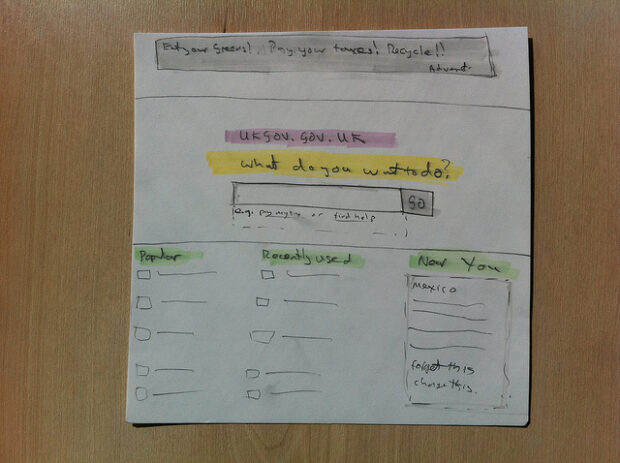
A early wireframe of the homepage from before we started thinking about how to handle departmental news and information.
It has a panel for displaying messages to people viewing the site from abroad. Localisation of the homepage is something we want to revisit. e.g. if you are a UK citizen abroad and visiting the UK government website there are a particular set of tools that are of more use to you (how to report a lost passport, get travel advice for the country you are in).
The homepage went through further iterations during design and build, for example the large homepage image you currently see on the site was a late addition.

3 comments
Comment by Russell posted on
Brilliant - I mean no one in the history of online government has EVER thought of doing this - wow! Post-it notes, brainstorming...
(do the hard bit - not the easy bit....jeez...)
Comment by Graeme Mulvaney posted on
Kudos on discovering paper!
Comment by Pete C posted on
I love sketching, and agree computers are still a long way off from matching the practical advantages – speed, price, maximal use of physical space. (Maybe NoteSlate will scratch where it itches.)
This post would be easier to read if there were side-by-side screenshots for the bits you built. Currently it requires a lot of tab switching/memory recall!
> guides to feel self-contained, to have ‘edges’
excellent, this is a practical alternative over monolithic hierarchies – small interdependent scopes/storyboards.
"What do you want to do?" sounds very Microsoftish, remember "Where do you want to go today?" Glad the phrase didn't make it to the front page. Not sure why I despise. Something about its redundancy/artificial empathy/patronising obviousness/active rhetorical questioning. The large-background-image-behind-search-box also looks like Bing – adding distracting clutter in the name of colourfulness and advertising. Okay, I've finished bashing now. 😉 A simple search box is quality, and a focus on actions over information is a helpful line of thought during the design process.
Love the tractor.